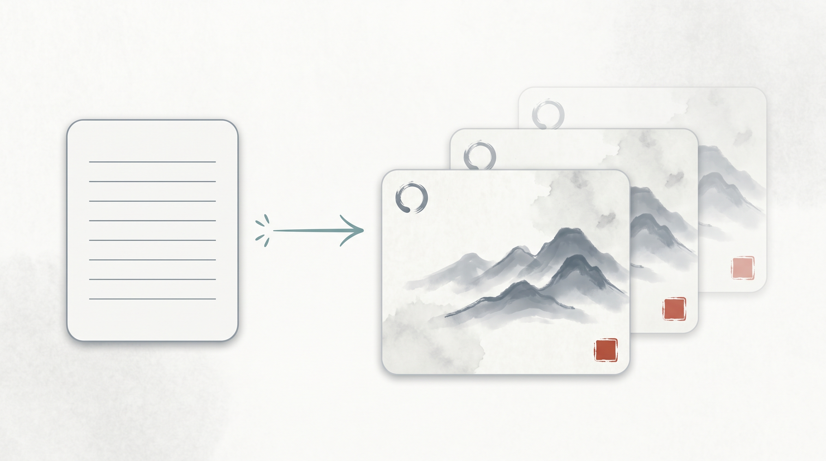
A reusable, slot-filled prompt template for 水墨 (ink-wash) style slide-deck images generated through GPT Image 2 — surfaced by a Chinese AI-tools community in May 2026. Instead of describing what you want in prose (“make it look East-Asian, ink-painting-style, with text on the left”), you fill in six structured fields plus implicit mood tags (Title / Key Points / Visual Elements / Layout / Hierarchy / Continuity Note + Mood) and the agent — typically Codex or Claude Code orchestrating GPT Image 2 — produces multi-page decks where pages share a visual family. Note the aesthetic vocabulary is pan-East-Asian: 水墨 (ink-wash) is a Chinese painting tradition, while Ensō and wabi-sabi are Japanese aesthetic concepts; the template’s “Visual Elements” field mixes them deliberately. The pattern generalizes: it’s the image-gen parallel to Thariq Shihipar’s HTML-is-an-interface thesis.
Source: Weibo post by 宝玉 xp on a GPT Image 2 水墨风格 Slides/PPT prompt template (May 2026; specific post URL not preserved). Companion entry: The Unreasonable Effectiveness of HTML
The Template
Title: [幻灯片标题 / slide title]

Key Points:
- [要点 1: 简洁的描述 / concise description]
- [要点 2: 核心数据或事实 / core data or facts]
- [要点 3: 关键结论 / key conclusion]

Visual Elements:
[描述视觉元素, 例如 / describe visual elements, e.g.]:
- 纹理宣纸背景 (Textured rice paper background)
- 水墨山水 (Ink-wash motifs)
- 简约的圆圈 (Ensō circles)
- 红色印章 (Red ink seal mark)
- 雾气效果 (Mist-grey effects)
- 整体风格保持: Quiet | Restrained | Wabi-Sabi |
  Contemporary East-Asian Luxury

Layout Preference:
[布局说明, 例如 / layout description, e.g.]:
- 左右分割 (Split layout)
- 居中对齐 (Centered layout)
- 文字居左右留白 (Left-aligned text with negative space)

Text Hierarchy:
[文字层级, 例如 / text hierarchy, e.g.]:
- 标题使用大号衬线字体 (Large Display Serif)
- 正文使用易读的衬线字体 (Body Serif)
- 确保视觉平衡和清晰的阅读顺序
  (ensure visual balance and clear reading order)

Continuity Note:
[延续性说明, 例如 / continuity guidance, e.g.]:
- 保持与前一页相同的背景纹理和色调
  (#F5F0E8, #2C3E2D)
- 使用相似的印章位置以维持视觉一致性
  (keep ink-seal placement consistent for visual continuity)
Drop the template into Claude Code or Codex, ask the agent to fill each field per slide based on your outline, then pipe the filled prompt to GPT Image 2 (or any comparable image model). The slot structure is what makes the multi-page output coherent.
The Six Fields (plus Mood Tags), Explained
| Field | Purpose |
|---|---|
| Title | The slide’s headline. Becomes the visual anchor. |
| Key Points | 3 bullet items — keeps the slide scannable, gives the image model anchor concepts for any text it renders. |
| Visual Elements | The aesthetic vocabulary. Naming specific motifs (ink-wash mountains, rice-paper texture, mist-grey effects, plus Japanese-borrowed terms like Ensō and wabi-sabi) gives the model concrete design language instead of vague “make it look East-Asian.” |
| Layout Preference | The compositional rule (split / centered / left-aligned with whitespace). Constrains where text and image-elements go. |
| Text Hierarchy | Serif specs (Display Serif for headlines, Body Serif for body). Keeps typography on-brand across pages. |
| Continuity Note | The cross-page contract — same background color hex codes, same seal placement, same texture. This is the slide-deck equivalent of a CSS stylesheet. |
| Mood tags (implicit, embedded in Visual Elements) | Quiet / Restrained / Wabi-Sabi / Contemporary East-Asian Luxury — high-signal style anchors the model can lock onto. |
Why This Pattern Works
Four reasons, each generalizable to other image-output workflows:
1. Structured Slots Beat Prose
Filling a slot is easier for both humans and agents than writing a paragraph of art direction. A coding agent like Claude Code can deterministically fill the template from a content outline (per slide); a human refining one slide doesn’t need to rewrite the whole prompt.
2. Visual Language Made Explicit
“Make it look East-Asian” → the model picks something generic / clichéd. “Textured rice paper background, ink-wash motifs, red ink seal, wabi-sabi mood” → the model picks specific visual primitives. Worth noting: the vocabulary here mixes traditions — 水墨 and rice-paper texture are Chinese; Ensō and wabi-sabi are Japanese. Be explicit about which tradition (or that you’re mixing them) to control the output.
3. Continuity Contract = Design System
A common failure mode in AI-generated multi-page decks is page-to-page coherence drift. The “Continuity Note” field is a per-page contract: same #F5F0E8 background, same seal in the lower-right, same texture. With it, the deck reads as cohesive rather than as a stack of unrelated images.
4. Output Is a Working Artifact, Not a One-Shot Image
A 10-page deck produced from this template can be edited, re-skinned, re-purposed. Same pattern as Thariq’s HTML thesis: structured prompts → artifacts you can keep using, not pretty pictures you discard.
The Companion to the HTML Thesis
| Output target | Anti-pattern | Structured pattern |
|---|---|---|
| Documents | One-shot Markdown report | Interactive HTML artifacts (see Unreasonable Effectiveness of HTML) |
| Slide decks / images | “Make it look pretty” prose | This template’s six structured slots + mood tags |
| Code | “Just write the function” | SKILL.md with Gotchas + structured references (see Anthropic Uses Skills — Thariq’s 9-Category Framework) |
The meta-rule: the format of your prompt should match the format of your output. Want a coherent multi-page deck? Use a slot-filled prompt. Want an interactive workspace? Ask for HTML. Want a reliable skill? Ship it as a folder, not a paragraph.
Variations Worth Trying
The template generalizes far beyond 水墨. Swap the Visual Elements field for any aesthetic vocabulary:
- Brutalist / Swiss minimalism: grid baselines, monospace headlines, ultra-flat color blocks
- Risograph print aesthetic: misregistered two-color overprint, halftone dot textures, paper grain
- Vaporwave / synthwave: neon gradients, pixel-grid floors, retro CRT scanlines
- Documentary / National Geographic: muted earth tones, photographic textures, gold-section margins
- Whiteboard sketch: rough hand-drawn lines, marker textures, deliberate imperfection
The six-field skeleton stays the same; only the vocabulary changes.
How to Operate It from Claude Code / Codex
1. Write your slide outline (titles + 3 key points per slide).
2. Drop this template into your CC/Codex session.
3. Ask: "For each slide in OUTLINE, fill the template fields,
   producing N filled prompts."
4. Pipe each filled prompt to your image model
   (GPT Image 2, Imagen, Midjourney via /imagine, etc.).
5. The Continuity Note field is the load-bearing piece — it's
   what keeps slide N visually consistent with slide N-1.
For full automation, wrap it as a Claude Code skill (generate-ink-deck/SKILL.md) with the template as a references/template.md file and a scripts/generate.ts that pipes filled prompts to your image API.
How LearnAI Team Could Use This
- Visual-prompt-template library — adopt this skeleton for LearnAI’s own course materials. Define LearnAI’s aesthetic vocabulary once (color tokens, typographic specs, layout rules) → the rest is plug-and-play across decks, infographics, social tiles.
- Slide-design lab — students take the same outline, generate one deck with prose prompts and one with the slot template, then compare cross-page coherence. Quantifiable lesson on prompt structure.
- Cross-cultural design module — teach the difference between cliché (“make it look Chinese”) and informed vocabulary (Ensō, wabi-sabi, mist-grey, rice-paper texture). Useful both for design ethics and for prompt-engineering precision.
- Skill creation exercise — wrap the template as a Claude Code SKILL.md with proper Gotchas. Students learn skill-design and prompt-engineering in one assignment.
- Output-format engineering curriculum — pair this entry with The Unreasonable Effectiveness of HTML. Same meta-lesson, two media: choose structure that matches artifact lifecycle.
Real-World Use Cases
- Course materials with cohesive aesthetic — lecture decks in a series end up visually consistent without manual designer review on every page.
- Brand-aligned content production — marketing teams define their visual vocabulary once, then generate variants of social tiles, blog headers, and pitch slides on the same template.
- Conference talks / internal presentations — a slot-filled prompt + outline produces a workable slide deck quickly; the Continuity Note is what keeps it from looking auto-generated.
- Cross-language localization — keep visual identity constant while swapping the text content per language. The continuity contract handles the look; the slot fills handle the content.
- Rapid design exploration — iterate aesthetic by swapping the Visual Elements field (water-color, brutalist, vaporwave, …) without rewriting the rest of the prompt.
- AI-design teaching — a concrete artifact for showing students that “prompt engineering” includes designing the prompt’s shape, not just its words.
Links
- Companion entry: The Unreasonable Effectiveness of HTML — Thariq’s Case for Output Format Engineering — same principle, different medium
- Related — slide-output skills: HTML PPT Studio, Make Slides, open-slide
- Related — prompt engineering: Prompt Master, Agents with Taste